Powerful Analytics. Simplified !
Arbutus Software Inc have officially launched a new release of Arbutus, so let’s find out what is new in Arbutus 8.0!
Arbutus 8 was designed to enlist everyone in the growing analytics movement.
- Ensure data quality
- Build complex analytics – easily
- Visualize results & engage your Team.
Watch this walkthrough video on Arbutus 8.0
Don’t want to just read about all the new and improved features? Then watch this video instead. If you still have questions afterwards, read the related paragraph or contacts us for more information.
What is new in Arbutus 8.0?
Overview
New features
- Added a DateSlice() Function
- Added Text() function
- Added Enhanced Results for the Classify, Stratify and Age commands
- Added Enhanced Results for the Compare command
- Added new Arbutus Connectors
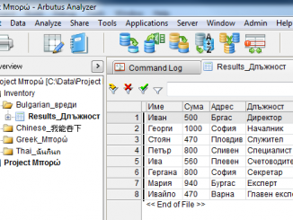
- Added new visualisations
- Added Set Timestamp command
- Added table list for ODBC/relational data sources
- Added/changed Preferences in tools/options/table
Enhanced features
- Enhanced Profile command (for AnalyzerPlus)
- Enhanced Summarize command to support date fields as keys
- Enhanced Classify command to support date fields as keys
- Enhanced Crosstab command to support date fields as rows or columns
- Enhanced Append command
- Enhanced Excel (OpenXML) import
- Enhanced pivot tables
- Enhanced Workflows
Updated features
- Updated Timestamp command preference
- Updated the Admin scheduling dialog
- Updated the DELETE ALL Command
What is new in Arbutus 8.0?
Details
New features
Added a DateSlice() Function
DateSlice() is a function that returns the character value of the specified date slice for a datetime.
The function syntax is DateSlice(D,S).
- D specifies the datetime
- S specifies the type of date slice
This function is useful as a filter to display all dates that fall within a specified date slice. You can slice dates using the these keywords:
- YEARLY (year as in 2021, 2022)
- QUARTERLY (quarter of specific year as in 2021-1, 2021-2, 2021-3, 2021-4. 2022-1)
- MONTHLY (month of specific year as in 2021-01, 2021-02)
- DAILY (the default, day of specific year as in 2021-12-30, 2021-12-31, 2022-01-01)
- QOY (Quarter of Year as in 1, 2, 3, 4)
- MOY (Month of the Year as in 01, 02, 03)
- DOW (Day of the Week as in 1-Sun, 2-Mon, 3-Tue)
- DOM (Day of the Month as in 01 to 31)
- DOY (Day of the Year as in 001 to 366)
If no date slice parameter is specified then a daily slice is assumed by default.
Added Text() function
Added Text() to display the contents of field or expression as a text string when you are unsure about the exact contents of the field or expression.
This function is similar to the Hex() function except that it returns the underlying data as a text string.
- If the field contains unprintable bytes, then they will still be unprintable in the resulting text string, and so will be displayed as a “corrupted” text string.
- If the field type isn’t UTF-16, the data will be converted from it’s original field type to Unicode before displaying the text string.
- For non-character fields, like NUMERIC, PRINT, LOGICAL or DATE, where the type of the underlying data (ASCII, EBCDIC, UTF-8 or UTF-16) cannot be determined, then the data will be assumed to be the same as the character type declared in the table layout (as seen in Edit Table Layout | Table Options | Character Type).
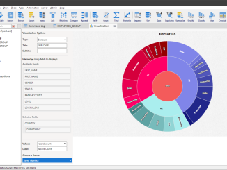
Added Enhanced Results for the Classify, Stratify and Age commands
Enhanced Results
Visualise your results quickly and easily
Access visual and tabular results Automatically when running Compare, Classify, Stratify, and Age commands
By default, the Classify, Stratify, and Age commands now output results to an Enhanced Results tab in the View.
Tip: To choose Enhanced Results click the [More] button in the command dialog and choose the Enhanced Results choice from the pull-down list in the “Output Options” section.
The Enhanced Results tab offers 3 sections:
- a tabular section displaying standard tabular results
- a visualization of the key field counts
- a visualization of the accumulated field totals for each individual keyfield/interval value
The arrangement of the 3 sections in the Enhanced Results tab can be changed by clicking the section icon on the top left of the Enhanced Results tab.
For each visualization, the type of visualization can be changed from either Bar, Column or Pie types by clicking the visualization pull down menu on the top right of each visualization.
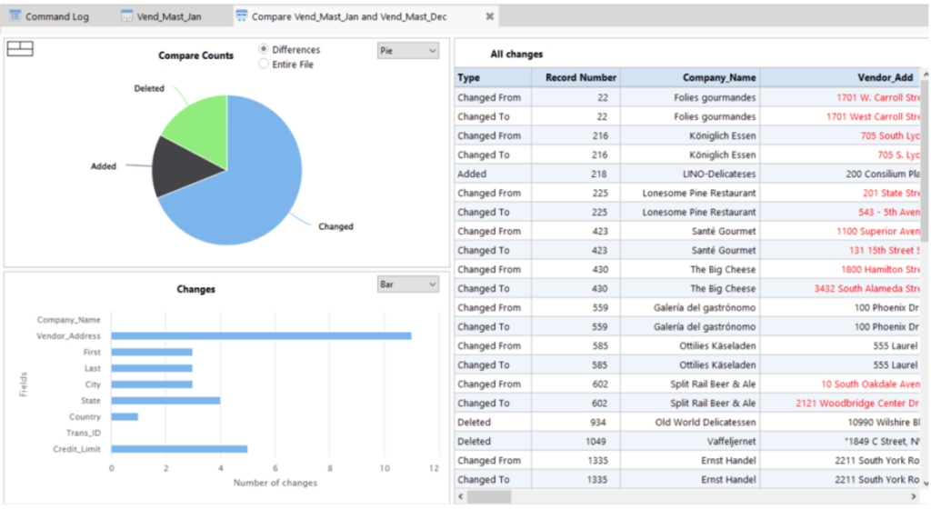
Added Enhanced Results for the Compare command
The Compare command can now (optionally) output results to an Enhanced Results tab in the View.
Tip: To choose Enhanced Results click the [More] button in the command dialog and choose the Enhanced Results choice from the pull-down list in the “Output Options” section.
The Enhanced Results tab offers 3 sections:
- a tabular section listing:
- a type column explaining the change (item inserted, item deleted, item changed from, item changed to)
Note: For changed items, there will be two records specifying the Changed From value and the Changed To value.
- a record column specifying the added/deleted/changed record number
- one or more value column(s) displaying the value of the compared column(s)
- one or more optional columns for any Other fields chosen to help clarify the changes
- a visualization of the changed/added/deleted counts
- a visualization reflecting the number of changes made (not including deletions or additions)
The arrangement of the 3 sections in the Enhanced Results tab can be changed by clicking the section icon on the top left of the Enhanced Results tab.
For each visualization, the type of visualization can be changed from either Bar, Column or Pie types by clicking the visualization pull down menu on the top right of each visualization.
For the section showing the visualization of the Compare Counts there are radio buttons to show:
- Differences – including only counts for the number of inserted/deleted/changed items
- Entire File – including a count of the number of unchanged items
Tooltips appear when the mouse is placed on a section of any visualization.
Clicking on a section of any visualization will update the tabular results to reflect the data in the chosen section.
Added new Arbutus Connectors
These new Arbutus Connectors have been added to the ODBC collection:
- Access
- Btrieve
- Oracle Financials Cloud
- Oracle HCM Cloud
- SharePoint
- Snowflake
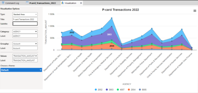
Added new visualisations
The following new visualisation have been added:
- Donut
- Large Heat Map
- Semi Circle Donut
- Stacked Area
Added Set Timestamp command
Added a Set Timestap command that can be used used interactively or in procedures to display the time stamp in the Command Log for commands as they are issued. Consistent with the Tools/Options/Interface preference to Time Stamp Commands.
Added table list for ODBC/relational data sources
When using the Data Definition Wizard, the Database Explorer, or the SQL command interactively, users can select a created table list file for ODBC/Relational data sources to streamline the loading and selection of desired tables for the ODBC/Relational data sources.
This is particularly useful to improve performance for loading data sources that are slow to populate their table lists (like Oracle and SAP), and allows the end user to streamline processing by showing only a short list of tables of interest.
Creating a Table List
Creating a table list file can only be done from the Select Tables panel in the Data Definition Wizard:
- In the Select Tables panel, highlight the tables to be saved in the list.
- Click the Create Table List button on the bottom of the Select Tables panel. You will be prompted to specify the location and name for saving the table list file.
Note: If some tables are selected, only those selected are written to the table list file. If no tables are selected, all tables listed are written to the table list file.
Using a Table List
To use a created table list, select the Select by Table List check box on the Select Data Source panel. This is only enabled if you have created a table list of desired files as described above.
The Select by Table List pull down menu is disabled until Select by Table List check box is checked. Once checked, you can select the desired table list file from the pull down menu.
Added/changed Preferences in tools/options/table
The following changes and additions have been made to Tools/Options/Table user preferences:
- Removed Auto Profile On Open preference
- Removed Display Format On Open preference
- Added Compress Output Data (Local) preference to enable users to ensure tabular results from commands run locally are compressed to save space
Enhanced features
Enhanced Profile command (for AnalyzerPlus)
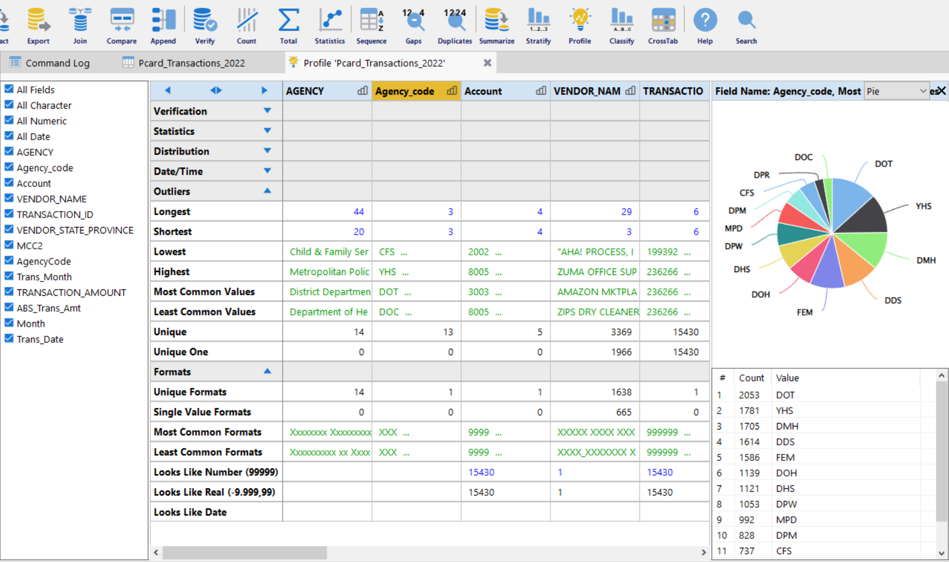
Extended Profile
Explore and access your data with one click!
Access up to 60 attributes for each field across 6 categories:
Verification, Statistics, Distribution, Date/Time, Outliers and Format.
The Enhanced Profile enables user to generate a summary overview and key metrics on one or more chosen fields in a table. This assists you in understanding your data and identifying possible anomalies within the data prior to embarking on detailed processing of a table.
The results of the Profile command are provided in a tabular format in an Extended Results tab that appears in the View area. Each field processed appears as a column in the Extended Results tab. Tool tips are provided in the Extended Results tab to explain each metric. You can also click on some metrics to drill down on the underlying data or to generate a visualization of the related data.
The Profile command also includes the ability to specify the maximum string length for character fields being processed by the Profile command. Strings longer than the maximum string length will be ignored (for instance memo type fields). By default the maximum string length is 40. This feature can be set in the Tools/Options/Commands preferences as Profile Max String Length.
Enhanced Summarize command to support date fields as keys
Enhanced the Summarize command to select a date field as a key. The chosen date key will be assigned a type of date slice that will be output as a character field.
To set the type of date slice, click [Choose] to display the selected fields dialog where you can specify the type of data slice to be used.
You can slice dates using the these keywords:
- YEARLY (year as in 2021, 2022)
- QUARTERLY (quarter of specific year as in 2021-1, 2021-2, 2021-3, 2021-4. 2022-1)
- MONTHLY (month of specific year as in 2021-01, 2021-02)
- DAILY (the default, day of specific year as in 2021-12-30, 2021-12-31, 2022-01-01)
- QOY (Quarter of Year as in 1, 2, 3, 4)
- MOY (Month of the Year as in 01, 02, 03)
- DOW (Day of the Week as in 1-Sun, 2-Mon, 3-Tue)
- DOM (Day of the Month as in 01 to 31)
- DOY (Day of the Year as in 001 to 366)
If no date slice parameter is specified then a daily slice is assumed by default.
Enhanced Classify command to support date fields as keys
Enhanced the Classify command to select a date field as a key. The chosen date key will be assigned a type of date slice that will be outputted as a character field.
To set the type of date slice, click [Choose] to display the selected fields dialog where you can specify the type of data slice to be used.
You can slice dates using the these keywords:
- YEARLY (year as in 2021, 2022)
- QUARTERLY (quarter of specific year as in 2021-1, 2021-2, 2021-3, 2021-4. 2022-1)
- MONTHLY (month of specific year as in 2021-01, 2021-02)
- DAILY (the default, day of specific year as in 2021-12-30, 2021-12-31, 2022-01-01)
- QOY (Quarter of Year as in 1, 2, 3, 4)
- MOY (Month of the Year as in 01, 02, 03)
- DOW (Day of the Week as in 1-Sun, 2-Mon, 3-Tue)
- DOM (Day of the Month as in 01 to 31)
- DOY (Day of the Year as in 001 to 366)
If no date slice parameter is specified then a daily slice is assumed by default.
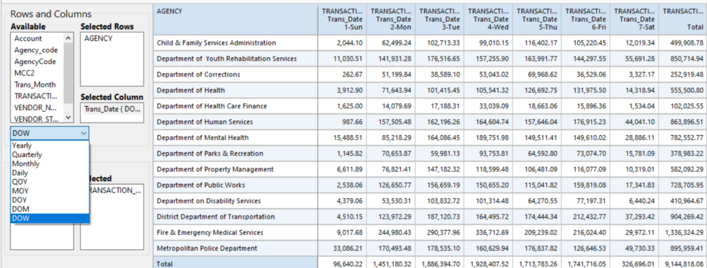
Enhanced Crosstab command to support date fields as rows or columns
Enhanced the Crosstab command to allow selecting date fields for rows or columns. The chosen date row or column key will be assigned a type of date slice that will be outputted as a character field.
To set the type of date slice, click [Choose] to display the selected fields dialog where you can specify the type of data slice to be used.
You can slice dates using the these keywords:
- YEARLY (year as in 2021, 2022)
- QUARTERLY (quarter of specific year as in 2021-1, 2021-2, 2021-3, 2021-4. 2022-1)
- MONTHLY (month of specific year as in 2021-01, 2021-02)
- DAILY (the default, day of specific year as in 2021-12-30, 2021-12-31, 2022-01-01)
- QOY (Quarter of Year as in 1, 2, 3, 4)
- MOY (Month of the Year as in 01, 02, 03)
- DOW (Day of the Week as in 1-Sun, 2-Mon, 3-Tue)
- DOM (Day of the Month as in 01 to 31)
- DOY (Day of the Year as in 001 to 366)
If no date slice parameter is specified then a daily slice is assumed by default.
Enhanced Append command
Arbutus 8.0 comes with an enhanced the table selection in the Append command to support mass selection of tables.
Enhanced Excel (OpenXML) import
The default Excel import has been enhanced to include an option to select individual columns (all columns are always selected by default) – you can now select the Edit Query check box on the Select Worksheet panel in the Wizard to enable column selection upon clicking Next.
Enhanced pivot tables
New & improved pivot table design
- Drill-down on pivot table results
The pivot table has been enhanced in the following ways:
- Improved the interface to make creating and scrolling the pivot table much faster
- Added drill down to the pivot table and the saved table created from the pivot table
- Added filtering to the pivot table:
- directly from the View filter
- indirectly using the new IF button to launch the Expression Builder to create a filter
- Added support for selecting date fields as rows or columns
- Available columns are now listed by view column title (not by field name)
Date fields may also be selected as rows or columns
- When choosing a date field to be used as either a row or column in the pivot table, the user can specify the type of date slice to be used (by default, a daily date slice is used).
- To set the type of date slice, the user can highlight the date field (before or after it has been selected) and then select the type of date slice to be used in the pivot table from the data slice pull down menu that appears below the row and column selectors.
- Added support for selecting related fields as rows or columns or a field to accumulate provided the related field is present in the active view.
Enhanced Workflows
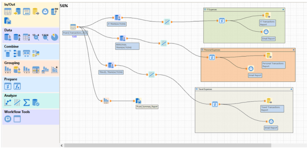
Containers
Group your commands into containers to help manage space and performance or to isolate a process.
Expand or collapse, move within your canvas, or disable to help debug or drive more perfomance.
Zoom
Navigate complex workflows easily by zooming in or out.
Copy / Paste
Speed up your work. Copy or paste one or more commands within your workflow or into a different workflow.
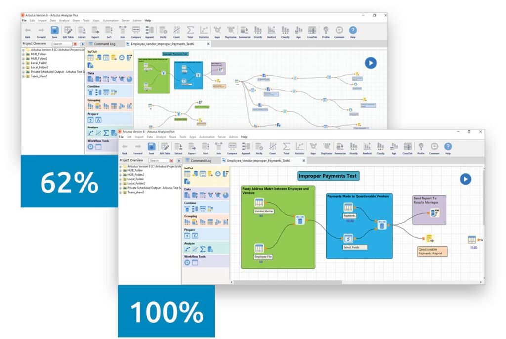
Workflows have been enhanced to support:
- Expanding or contracting the Workflow Grid using the scroll wheel on your mouse.
- Placing sections of a complex workflow into a container to distinguish one section of a complex workflow from another. Containers can be positioned, sized, expanded, contracted, commented, disabled and styled.
Workflow icons can now be copied and pasted individually or as a group of selected icons. They can be copied and pasted within the active Workflow or from the active workflow to another workflow.
Tip: This is useful for replicating complex workflows or for replicating workflow icons that are more complicated to setup like the Notify command.
Updated features
Updated Timestamp command preference
Made the Time Stamp Commands preference on by default
Added a new right click option “Timestamp Commands” in the Command Log to turn on time stamping for commands. Selecting this option will also set the Time Stamp Commands preference on
Updated the Admin scheduling dialog
Updated the visual look of the Admin | Scheduling Dialog and better arranged the column order.
Also added some coloring to highlight information of interest:
- Status (Green = Active / Red = Suspended)
- Last Result (Green = Pass, Red = Fail).
Updated the DELETE ALL Command
Updated the Delete All command so that it no longer deletes permanent variables.