This page illustrates the extremely powerful analysis options Pentana provides, including:
- Audit coverage
- Risk exposure & heat map
- Control coverage & matrix
- Incident & action tracking
- On-the-fly analysis
Audit coverage
Interactive audit coverage analysis
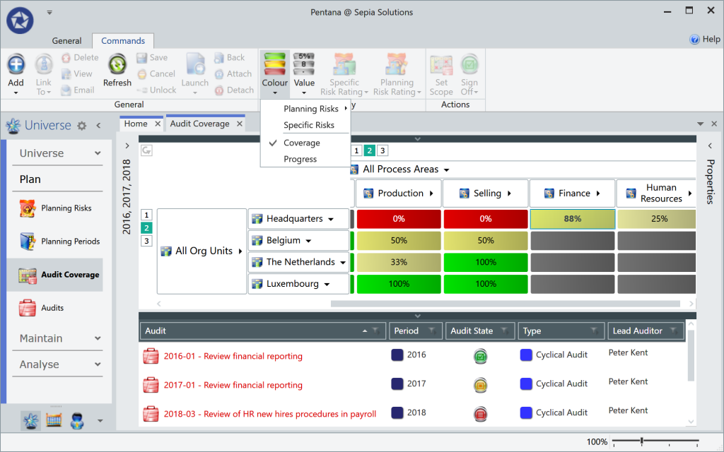
The fantastic Audit Coverage screen displays the Audits overlaid on the 2-dimensional audit universe.
The screen can zoom in to the low-level entity-process combinations, or they can be rolled up to an aggregated level which explains the percentage ranging from 0% to 100%.
One or multiple years can be selected for the analysis (in the illustration 2016-2018), while further criteria can be added in a pre-filter (e.g. audit type, year, lead auditor, rating, etc.).
Clicking on a cell in the top half of the screen will display the corresponding audits and details in the bottom half of the screen.
Risk exposure & heat map
Risk heat map
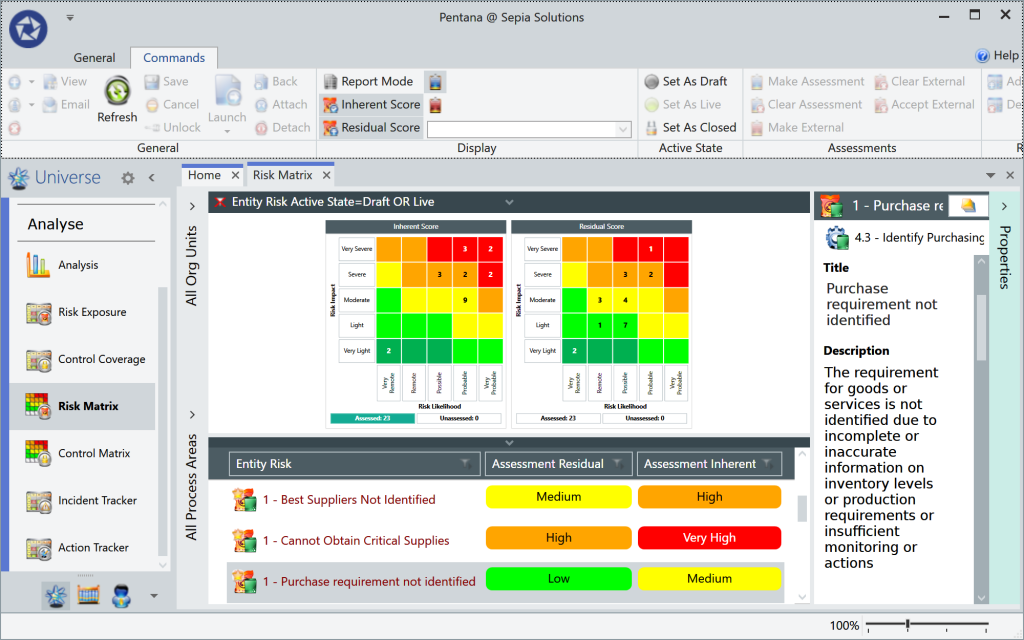
The well-known “heat map” is generated based on the configurable risk matrix (up to 10×10) in which the number of entity-level risks, corresponding to each of the cells, are counted.
Further analysis choices include showing the inherent/residual scores, or displaying internal/external risk Assessments.
As with all these analysis screens, clicking on any part of the graph will display the corresponding records in the bottom half of the screen. Selecting any record will bring up the properties on the right and allows the user to click-through to the selected record or context.
Risk exposure
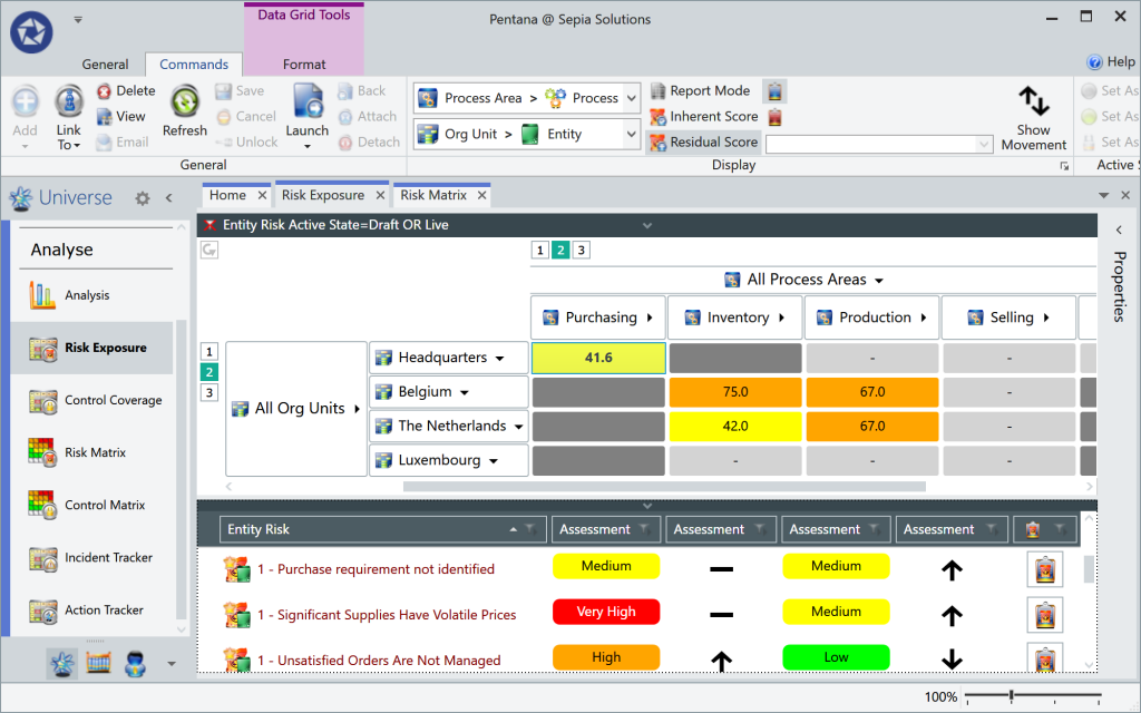
The “Risk Exposure” screen will again use the 2-dimensional GRC universe as a basis for displaying the aggregated scores of the Entity Risks. The aggregated score (based on either inherent/residual or internal/external assessments) is displayed and drives the colour of the cell.
Optionally the “movement” or “trend” of the risk score is displayed on the graphical overview. In the illustration this movement is displayed in the bottom half of the screen as part of the details corresponding to the selected cell (Purchasing) in the matrix.
Control coverage & matrix
Control matrix
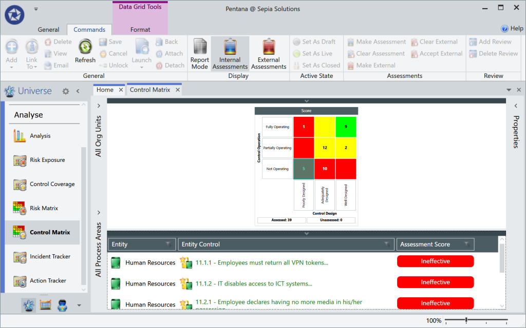
The opposite of the risk heat map is the “Control Matrix” screen where all entity-level controls are plotted onto the configured matrix (up to 10×10) based on the internal/external Control Assessments.
This overview makes it extremely easy to locate the poor controls as clicking on the cell will bring up the list of all controls in that cell. The matching records in the bottom half of the screen can be opened or hovered over. The latter will show a pop-up window with the context of the control.
Control coverage
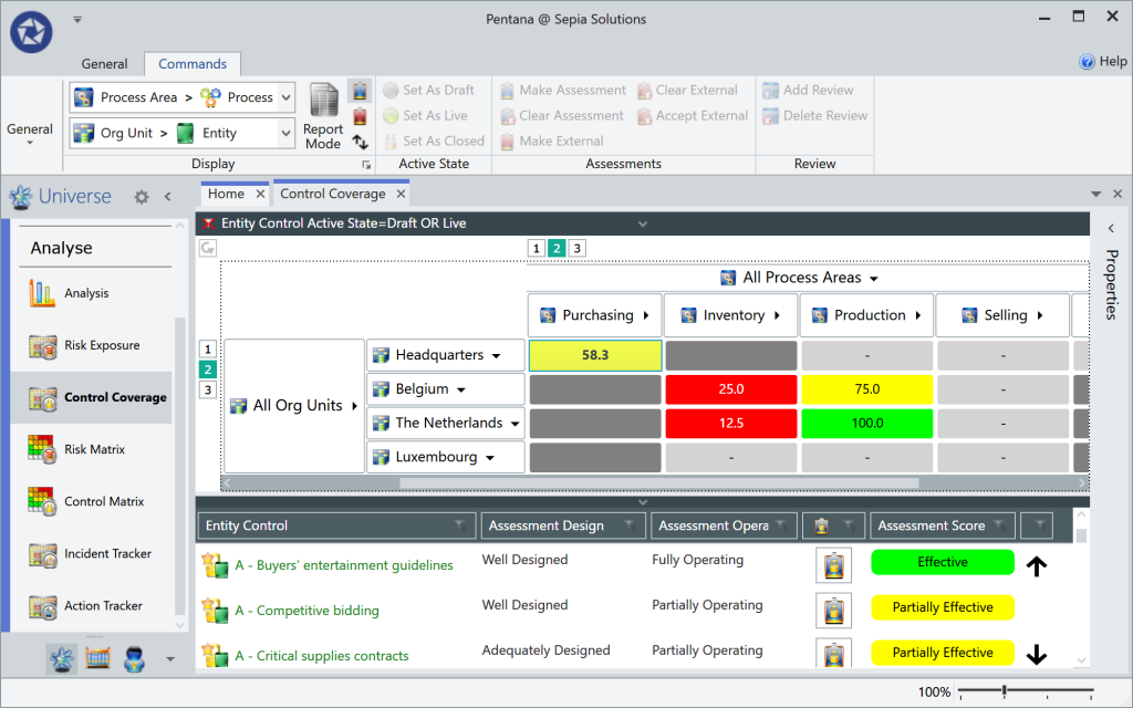
The “Control Coverage” screen will also use the 2-dimensional GRC universe as a basis for displaying the aggregated scores of the Entity Controls. This score drives the colour of the cells.
Optionally the “movement” or “trend” of the risk score is also displayed on the graphical overview. In the illustration this movement is displayed in the bottom half of the screen as part of the details corresponding to the selected cell (Purchasing) in the matrix.
This information paints a perfect picture of “where the organisation is really in control” (or isn’t).
Incident & action tracking
Incident tracker
The “Incident Tracker” screen again uses the GRC universe to plot the Incidents (or near misses) onto.
The cells can display the number of incidents matching the set criteria in the pre-filter or the total monetary value of the incidents. This analysis module provides an easy way to get an overview of the incidents or near misses across the organisation.
Action tracker
The most efficient way to review and report action follow-up would be using the “Action Tracker” screen which displays the number of Actions overlaid on top of the GRC universe.
As always in this type of screens, the columns/rows of the universe can be expanded and collapsed to zoom in or aggregate.
The displayed number of actions is influenced by the pre-filters set by the user (e.g. overdue actions, open actions, high priority actions, actions with updates, etc.).
Action aging analysis
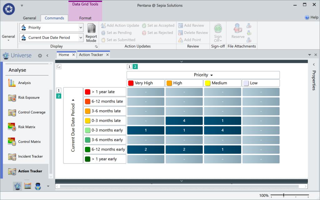
All analysis screens based on the two-dimensional universe can also use other parameters for both dimensions.
Using the same “Action Tracker” screen it is therefore very easy to build an “action aging” overview similar to an invoice aging analysis. The analysis in the illustration looks a lot like a pivot table plotting the number of actions based on their priority and due date period (time till/since the deadline).
On-the-fly analysis
Generic analysis options
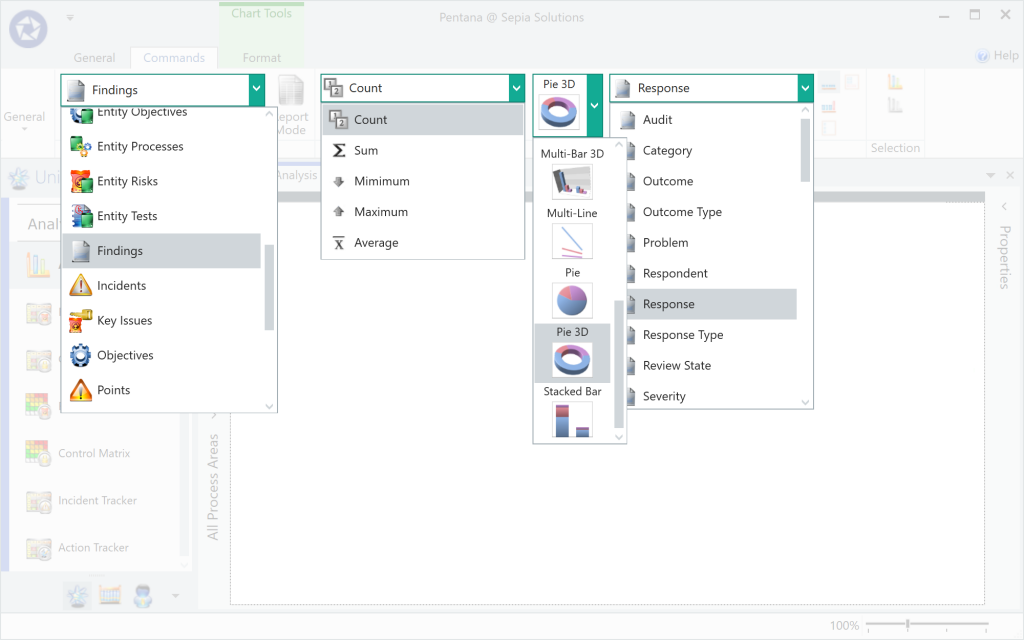
Questions of a statistical nature that cannot be answered using the standard views or special-purpose analysis screens can most likely be answered using the generic Analysis screen.
In this general purpose analysis screen, the user first selects the component to report on (e.g. Incidents, Risks, Findings, Audits, etc.). Then the type of value to use (count, sum, average, min, max) and the graph type are selected and subsequently the field to be analysed. Certain chart types such as stacked bar chart can work with two fields simultaneously.
Example: Findings by response
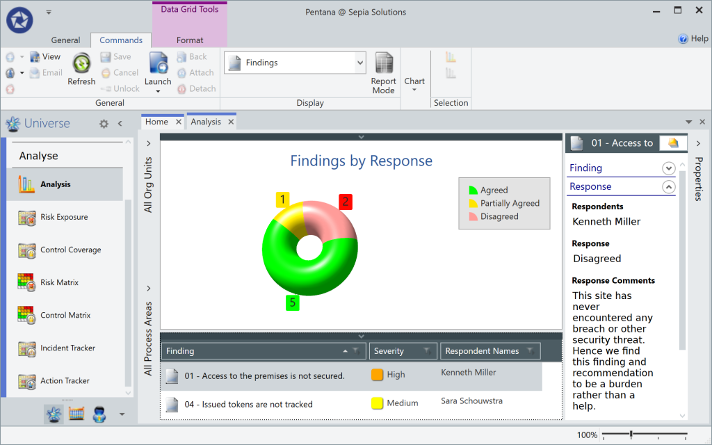
Question like “how many” can be easily answered via the generic analysis screen in just a few seconds.
- Wondering how many findings or recommendations were accepted or disagreed to?
- Need to filter that down to only last year’s audit?
- Need to graphically show this per auditee?
All parts of the graphs are also context sensitive. If the user clicks on the screen, the relevant records are displayed in the bottom half of the screen. Clicking on those records, the user can see all properties and context but can also navigate of “jump” to the particular record wherever it exists (e.g. in an audit).
Example: Audits per year and status
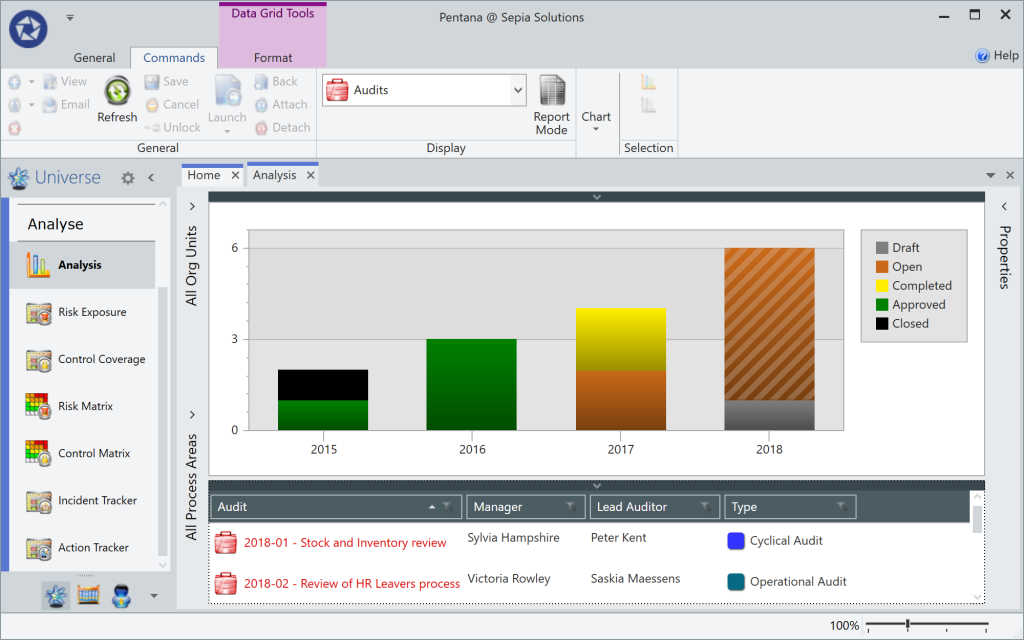
Plotting the audits per year, using the status for colour? No problem!
The segments of the bar chart remain context sensitive. Just click on the part that peaks your interest and get all the details in the bottom half of the screen.
Further filtering is possible through the pre-filter based on segmentation type fields, or using scope elements such as Entities and Processes.
Example: Actual audit time per year
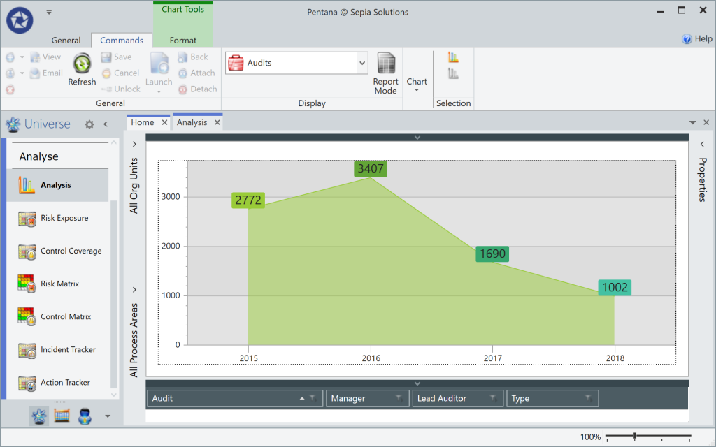
Based on actual time (i.e. Timesheets), how much time was actually spent performing audits over the last couple of years?
These are just a few example questions answered via the analysis module, as nearly all fields for nearly all components are available for analysis; there are way too many possible combinations to give a true account of the possibilities. However, it is hoped that these examples give an idea of the potential.
If you put meaningful data in, Pentana can get it out in a meaningful way!
We can tell you so much more!
Sepia Solutions specialises in this software and has a proven track record of successful implementations. This website documents just the tip of the iceberg. Invite us for an on-site presentation for a more interactive demonstration of the Pentana software. We can discuss your organisation, department and objectives to come to a tailored implementation plan.
No costs, no obligations, only additional insights.